Safety signs are a type of sign designed to warn of hazards, indicate mandatory actions or required use of Personal protective equipment, prohibit actions or objects, identify the location of firefighting or safety equipment, or marking of exit routes.
In addition to being encountered in industrial facilities; safety signs are also found in public places and communities, at electrical pylons and Electrical substations, cliffs, beaches, bodies of water, on motorized equipment, such as lawn mowers, and areas closed for construction or demolition.
One of the earliest attempts to standardize safety signage in the United States was the 1914 Universal Safety Standards.[1] The signs were fairly simple in nature, consisting of an illuminated board with “DANGER” in white letters on a red field.[1] An arrow was added to draw attention to the danger if it was less obvious. Signs indicating exits, first aid kits consisted of a green board, with white letters. The goal with signs was to inform briefly.[1] The next major standards to follow were ASA[a] Z35.1 in 1941, which later revised in 1967 and 1968. The Occupational Safety and Health Administration devised their requirements from ASA Z35.1-1968 in the development of their rules, OSHA §1910.145 for the usage of safety signage
Prior to widespread globalization and adoption of standards from the ISO, most countries developed their own standards for safety signage. Text only signs were common prior to introduction of European Council Directive 77/576/EEC on 25 July 1977, which required member states to have policies in place to ensure that “safety signs at all places of work conform to the principles laid down in Annex I”, which required color coding and symbols. In 1992, the European Council Directive 92/58/EEC replaced EEC 77/576/EEC. The new directive included improved information on how to utilize safety signage effectively. Beyond safety signs, EEC Directive 92/58/EEC standardize markings for fire equipment, acoustic signals, verbal and hand signals for vehicle movements.[6] In 2013, the European Union adopted ISO 7010 to replace the symbols provided previously, adopting them as European Norm (EN) ISO 7010, standardizing symbols among the EU countries. Prior to this, while symbols were provided, symbols were permitted to vary in appearance “provided that they convey the same meaning and that no difference or adaptation obscures the meaning As a means of overcoming language and literacy barriers, symbols depicting the hazards, required action or equipment, prohibited actions or items and safety equipment were introduced to safety signage during the 1990s. Globalization and increased international trade helped push this development, as a means of reducing costs associated with needing signage multiple languages.[3] Increasingly, countries are adopting symbols used by ISO 7010 and UN Globally Harmonized System of Classification and La belling of Chemicals, that harmonizes symbols internationally to reduce confusion, and bring themselves into compliance with international standards.
For temporary situations such as wet floors, portable signs are used. They are designed to be self supporting and relatively easy to move once the task is complete. The 1914 Universal Safety Standards[1] provided for a portable ‘Danger’ sign suitable for both hard floors and soft dirt. Portable signs can take a variety of forms, from a traffic cone with stick on letters, plastic a-frame signs, to safety signs mounted on poles with bases that enable movement.[12]
Wet floor signs are also intended to avoid legal liability from injury due failing to warn of an unsafe condition.Since the late 1980s, more emphasis has been put on testing signage for clarity and to eliminate possible misunderstandings. Researchers have examined the impacts of using different signal words, inclusion of borders and color contrast with text and symbols against sign backgrounds.[17] In 1999, a group of designers were tasked with creating standardized warning labels for personal watercraft. The group devised several versions of the same warning label using different symbols, wording and emphasis of key phrases through use of underlining, bold fonts and capitalizing. The label designs were reviewed by the United States Coast Guard, United States Power Squadron, industry representatives and subjected to ease of comprehension and readability tests. Results of these reviews and tests lead to further revisions of words and redesigning of some symbols.[18] The resulting labels are still applied to personal watercraft nearly 20 years after their initial design.
Placement of signs also affects the effectiveness of signs. A 1993 study tested compliance with a warning against loading the top drawer of a filing cabinet first. The warning was least effective when it was only placed on the shipping box, but most effective when placed as part of a removable cardboard sleeve that physically obstructed the top drawer, interfering with adding files to the drawer.
Sign effectiveness can be reduced from a number of factors, including information overload, where the sheer amount of information is presented in a manner that a reader is unable process it adequately, such as being confronted by a sign consisting of dozens of words with no paragraph breaks, or excessive amounts of unnecessary information.[f] This can be prevented through simplifying warnings down to their key points, with supplementary manuals or training covering the more nuanced and minor information. Over warning is a related problem, where warnings are overlooked by people due to the sheer number of warnings, such as placing many safety signs together, redundant or obvious warnings.[17] Effectiveness can be reduced through conditions such as poor maintenance, placing a sign too high or low, or in a way that requires excessive effort to read They are usually yellow.[14] The warning is sometimes enhanced with new technology to provide audible warnings.[15] Robotic cleaning equipment can use wet floor signs
with sonar gadgetry to know when its job is finished
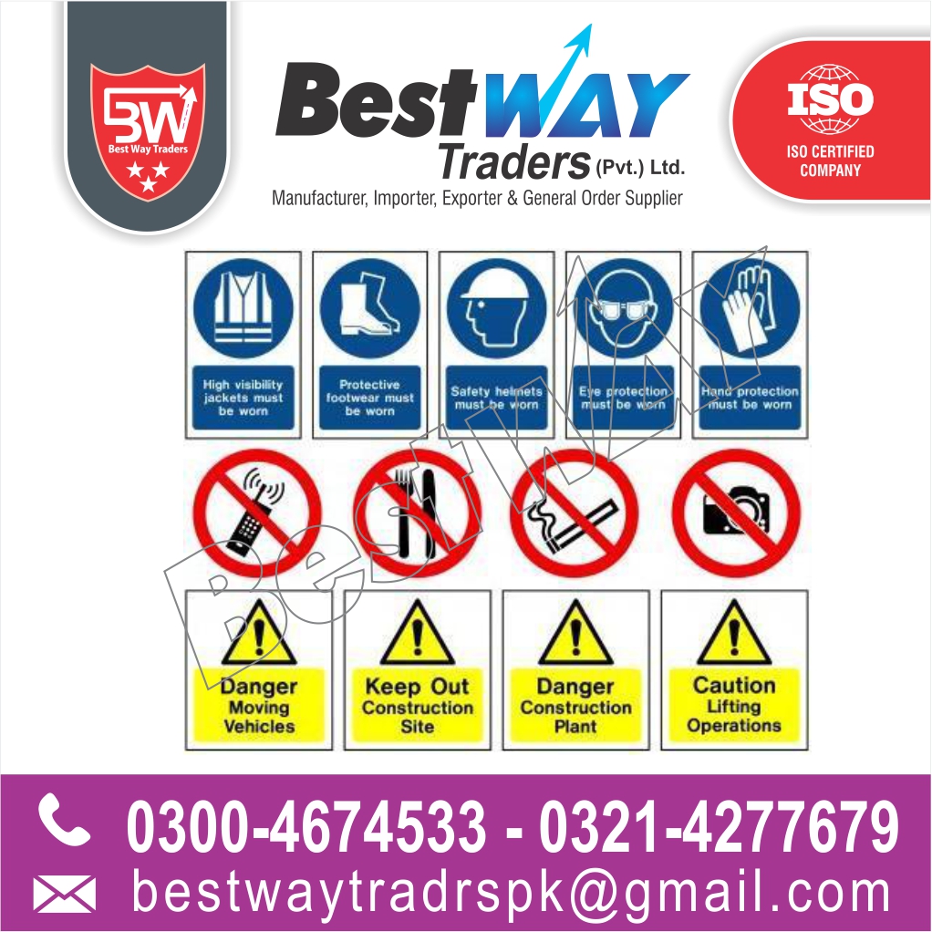
As an employer, you must understand safety signs and their meanings so that you can appropriately use the correct safety signs in the workplace. Health and safety signs come in four distinct and each indicates a different warning or precaution.
Blue safety signs are mandatory signs that explain a specific action. A yellow safety sign is a warning or caution sign. Red safety signs usually indicate danger or prohibition of a certain substance or act. Green signs are not designed to highlight danger, and instead indicate helpful information and safe points, such as fire exits or first aid points.
Using the correct safety sign as an employer is a legal requirement set out by the Health and Safety Executive, and it is therefore essential to understand health and safety signs and their meanings in order to ensure your workplace is being kept safe.
Safety signs and the law
All employers have a legal duty to display safety signs where there is a risk to the safety of pedestrians or employees, despite putting other safety measures in place. You can risks by conducting routine workplace health and safety assessments, and following the Control of Substances Hazardous to Health guidelines if you use hazardous substances in your place of work.
Every safety sign should be clearly visible and legible and should only be used to identify the correct actions, such as the use of personal protective equipment (PPE), or no access zones. Using too many signs could be confusing. You only need to put up a safety sign if there is a danger that poses a significant risk. Whilst health and safety signs are not always required by law, they can still be helpful.
You can find out more information about the Health and Safety (Safety Signs and Signals) Regulations 1996 on the government website. This is the law you must follow when displaying health and safety signs in the workplace.
Explaining the meaning of common health and safety signs
Safety signs can vary in color, size and shape. You should understand which safety sign you need in your business, as this will depend on the type of business you run. Usually, green safety signs are the most common, as all workplaces must indicate fire exits. If you use or store hazardous substances, yellow safety signs should be used.
Below we look at the different common types of health and safety signs and their meanings:
Danger or prohibition signs These safety symbols must be red and indicate that dangerous behavior must be stopped. They can also tell the reader to stop or not enter. For a prohibition sign to be within the law, red must cover at least 35% of the sign. Usually, these safety symbols have a black image on a white and red background. For prohibition signs, a red circle with a strike-through line indicates which action must be stopped. The most common red prohibition signs are no-smoking signs.
These are health and safety signs with a yellow background that tell the reader to take precautions or be careful. They warn of possible dangers, such as an electric or trip hazard. Warning signs are often triangular in shape, with a black image and black edging. These warning safety signs are usually accompanied by some text explaining the warning in more detail.
Mandatory health and safety signs are always blue and tell the reader that a certain action is required. If you work in construction, these are commonly seen at the entrance to the construction site and tell employees that they must follow a certain action, such as wearing the appropriate PPE. These mandatory signs are on a blue background with white text and a white image.
Emergency exit signs are always green in color. They represent a safe escape route if there were to be a fire in the building. These are usually standardized and have a green background with white writing, with a man running out of a door.